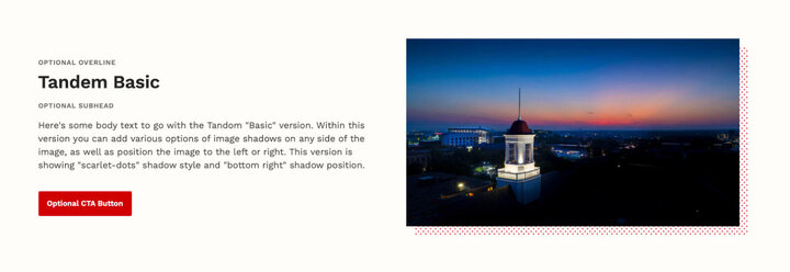
A Tandem component allows you to add headings and text/images formatted in a full-width section that is offset with a background image. There are mutiple display and positioning options.
This component consists of a title, optional overline and subhead, a formattable text box, optional CTA links or buttons, and an image field. It also has three different display options for display of the text and image.

Stack: The headline/text area is inset in a white box above the background image, and that headline, text, and formatted links can then be floated to the left, center, or right.


Fade: The headline/text area is inset in a gray box that fades into the image, and those headline, text, and formatted links can then be floated to the left or right.

Basic: The headline/text area is floated either to the left or the right of the image, and the image can have a drop shadow (of several different types) applied to any corner.
Restrictions
The Tandem component can be used in the following section layouts
- One column