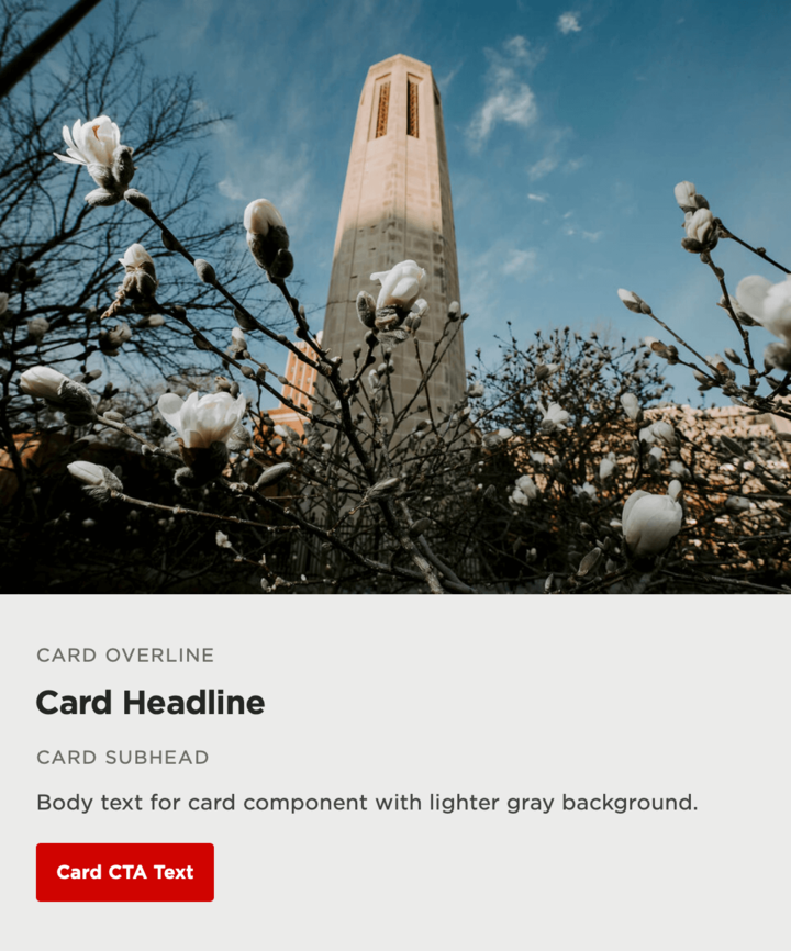
A Card is typically used to briefly describe a longer piece of content that you want to highlight within another page (with a CTA to associated page), or to feature a smaller piece of content with an associated image.

It consists of a title, an optional overline, an optional subhead, an image, body text, and an optional link.
Restrictions
The Card component can be used in the following section layouts
- Two column
- Three column
- Four column